What Is Color?
The Irreducibility of Physical Stimulus to Neural Information and Psychological Experience, and the Material Properties of Colorants
A comprehensive study of color vision, structural color, and heat-resistance hypotheses
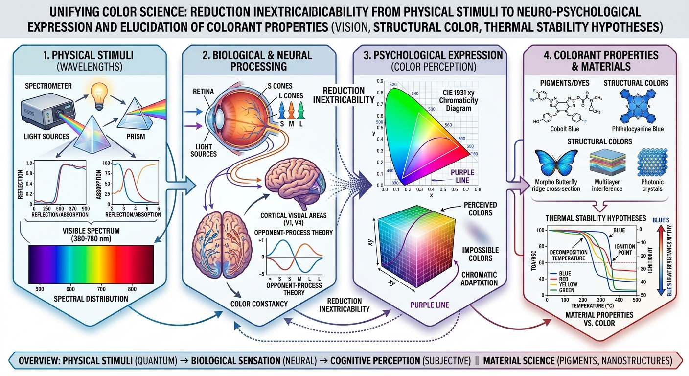
Wavelength is a physical quantity; color is a percept. The blue of a morpho wing that vanishes in liquid, a blue pigment that breaks down at around 200 °C, and the green that survives the most heat: we examine how color relates to matter from three angles — vision, structural color, and heat resistance.
In air: a large refractive-index contrast with chitin reflects blueIn ethanol: the contrast shrinks and the blue is lost
Conclusion
“Color” is not an objective material property that exists independently in the physical world. Light is processed by the eye and nervous system, and a relational perceptual construct is built in the brain’s visual cortex.
“Color” is not an objective material property that exists independently in the physical world. It is a relational perceptual construct: a physical stimulus — electromagnetic waves (light) in a particular wavelength range — is converted and processed by the photoreceptors of the eye and the nervous system, and is constructed in the visual cortex of the brain. All that exists in the physical world is the spectral radiance distribution of electromagnetic waves and the spectral reflectance of objects. Qualitative experiences (qualia) such as “red” and “blue” appear only through the neural processing of an organism’s visual system.
Moreover, the hypotheses that “the color blue itself is hard to burn” and that “substances that make blue have higher heat resistance than other colors” (Hypotheses A, B and C) are completely refuted from the standpoint of materials science and thermodynamics. Prussian blue, an inorganic complex and a representative blue substance, undergoes rapid exothermic oxidative decomposition in air at a relatively low 200–270 °C, releasing toxic hydrogen cyanide gas. Organic blue dyes and pigments such as indigo and phthalocyanine blue are also flammable or thermally decomposable. Meanwhile, chromium oxide (a green pigment) melts at 2435 °C, and iron oxide (a red pigment) shows extremely high thermal stability above 1500 °C.
The heat resistance and flammability of a substance are determined by its electron configuration, chemical bond energies and crystal lattice energy, and have no physical causal relationship with the wavelengths it selectively absorbs or reflects in the visible range (that is, its color). The intuition that “blue means hard to burn” is merely a cognitive bias, stemming from a psychological misunderstanding of the hot blue flame of complete combustion (emission from CH* and C2* radicals) and from the image of certain inorganic pigments.
What Is Color, Really?
To answer the question “does color exist in the physical world?” scientifically, we need to define each stage — physical stimulus, biological reception, neural transmission and subjective perception — and keep the conceptual boundaries between them distinct.
Strict definitions of the physical and neural/psychological elements
- Light (electromagnetic waves)
- An oscillation of the electromagnetic field propagating through space, described by the speed of light in vacuum c, frequency ν and wavelength λ (λ = c/ν). Visible light roughly spans wavelengths from 380 nm to 780 nm.
- Wavelength and spectrum (spectral distribution)
- The spatial period of a single electromagnetic wave (wavelength), and the distribution S(λ) of energy intensity across the wavelength components contained in light.
- Reflection and absorption by objects (spectral reflectance)
- The fraction R(λ) of light that the surface material of an object reflects, transmits or absorbs at each wavelength as it interacts with light.
- Retina and cone cells
- The biological receptors that absorb incoming photons and convert them into changes in membrane potential (electrical signals) through structural changes in the retinal photoreceptor proteins (opsins).
- Neural signals and the brain
- Patterns of impulses transmitted and integrated through retinal ganglion cells, the lateral geniculate nucleus (LGN), the primary visual cortex (V1) and higher visual areas (V4/VO).
- Color perception (qualia)
- Subjective sensory experiences such as “red” and “blue”, generated in the brain as the result of a chain of neural information processing.
The decisive difference between “wavelength” and “color”
A “650 nm wavelength” and the perception of “red” are not equivalent. Wavelength is merely a continuous physical measurement along a one-dimensional axis, whereas color is an attribute of a multidimensional psychological space (hue, lightness, saturation) defined inside the visual system. To understand the difference, we separate the following four concepts.
Light at 650 nm
An electromagnetic wave with a single physical wavelength λ = 650 nm — an oscillation of the field traveling at about 300,000 km/s in vacuum. It has no attribute of “redness” in itself.
The perception of “red”
A subjective quale generated in the visual cortex (area V4 and others). A sensory experience integrated in the brain through opponent-color circuits when L-cone stimulation greatly exceeds M-cone stimulation.
A red object
An object whose spectral reflectance R(λ) absorbs 400–550 nm (blue to green) of the illuminating light and strongly reflects 600–700 nm (red). The molecular and crystal structure of its surface causes the selective absorption of light.
A red pigment
A chemical substance that selectively absorbs a particular wavelength band (for example iron oxide Fe2O3 or cadmium red CdS1−xSex). Electronic transitions within the molecule (d–d or π–π* transitions) convert and absorb green-to-blue photons as heat.
Even for light of the same wavelength, the perceived color changes with the surrounding illumination and context (color constancy). And because lights with completely different spectral distributions can look the same color (metamerism), wavelength and color are clearly distinct both physically and neuroscientifically.
Human Color Vision
Human daytime vision (photopic vision) is based on trichromacy, mediated by three types of cone cells in the retina. However, the popular shorthand “S = blue, M = green, L = red” does not accurately reflect the physiology.
Spectral sensitivity of the cones, and why the common explanation is inaccurate
The peak wavelengths (λmax) of the absorption spectra of each cone (for example, Stockman & Sharpe’s Fundamentals) are as follows. Pick a wavelength in the chart below to see how the three cone types respond.
▲ Click or tap a segment to choose a wavelength on the chart above (20 nm steps)
Selected wavelength:
| Cone type | Common name | Peak wavelength (λmax) | Actual sensitivity range | Main features |
|---|---|---|---|---|
| S cone (Short) | “Blue” cone | ~420–440 nm | ~380–530 nm | Peaks in the violet-to-blue range. A distinct minority, about 5–10% of all cones. |
| M cone (Medium) | “Green” cone | ~530–534 nm | ~400–650 nm | Peaks in the yellow-green range. Its sensitivity curve overlaps the L cone’s over a wide range. |
| L cone (Long) | “Red” cone | ~560–564 nm | ~400–700 nm | The peak lies not in “red” but in “yellow-green.” |
The L cone peaks at about 560 nm, and physically it responds most strongly to “greenish-yellow” light. Calling the L cone alone a “red cone” is therefore physiologically inaccurate. Humans sense “red” not from the response of the L cone alone, but when the L-cone response greatly exceeds the M-cone response (the neural comparison L − M > 0).
The principle of univariance and the combinatorial model
A single cone cell cannot retain information about the wavelength of the photons it absorbs. This is called Rushton’s principle of univariance. When the photoreceptor protein (retinal plus opsin) absorbs a photon and isomerizes, the size of the resulting change in membrane potential depends only on “the number of photons absorbed”; whether the photon was 450 nm or 600 nm, the neural response after absorption cannot be told apart.
If the total absorption A — the integral of the absorption probability P(λ) times the incident intensity I(λ) — is the same, a single cone outputs the same impulses, so a single cone cell is essentially “color-blind.” Humans can distinguish colors because retinal ganglion cells and the brain contain neural circuits (opponent-color circuits) that compare and compute the response ratios of the three cone types (S, M, L), whose sensitivity bands differ. Color perception is not a simple sum of three stimulus values but the product of nonlinear opponent signal processing.
Purple, Magenta and Non-Spectral Colors
The color percepts produced by light of a single wavelength and by a mixture of several wavelengths are clearly different physically.
Physical and neural definitions of spectral and non-spectral colors
- Monochromatic light (single wavelength)
- Light consisting of only one physical wavelength λ0 (a delta-function spectrum).
- Polychromatic light (multiple wavelengths)
- Light in which several different wavelength components are mixed over a broad band.
- Spectral colors
- Color percepts produced by monochromatic light — the colors on the visible spectrum (red, orange, yellow, green, blue, violet).
- Non-spectral colors
- Color percepts that never arise from shining any single wavelength on the retina. They are generated in the brain only when polychromatic light arrives simultaneously in particular proportions (for example magenta, reddish purple, pink).
Examining the claim that “purple does not exist as a single wavelength”
The claim that “purple does not exist as a single wavelength” contains a misunderstanding that stems from confusing terms.
Violet
Exists as a single wavelength. Monochromatic light near 400 nm strongly stimulates the S cones and also slightly stimulates a secondary sensitivity peak on the short-wavelength side of the L cones (an absorption-band property of the opsin protein), so even a single wavelength is perceived as a “violet” that seems to mix blue and red.
Magenta / purple
Never exists as a single wavelength. It is a non-spectral color that the brain forms only when long-wavelength light (red, about 700 nm) and short-wavelength light (blue, about 450 nm) enter the retina together while the medium-wavelength (green, about 530 nm) component is missing.
Do not confuse “not existing as light of a single wavelength” (the absence from the physical spectrum) with “purple or magenta not existing as human sensations” (the absence of psychological experience). The perceptual experience of magenta itself is a real perceptual phenomenon that clearly exists in the brain.
Geometric representation on the CIE 1931 xy chromaticity diagram, and the neural mechanism
On the CIE 1931 xy chromaticity diagram, the locus of monochromatic light traces a horseshoe-shaped curve (the spectral locus). The straight line joining 380 nm (the violet end) and 700 nm (the red end) is called the “purple line,” and every color on this line is a non-spectral color that cannot be reproduced by light of a single wavelength.
When red light (700 nm) and blue light (450 nm) are mixed, the chromaticity coordinates move along the segment joining the two points, following the principle of additive mixing. Because this segment passes through the interior of the horseshoe near the purple line, a color sensation running directly from magenta to purple is induced without passing through the spectral locus of medium wavelengths (green).
Red and blue arrive together with no green (about 530 nm) component.
In the neural circuits from the retina to the LGN (lateral geniculate nucleus), the following opponent-color channels exist.
- Red–green channel
(L − M) - A positive value signals “red,” a negative value “green.”
- Yellow–blue channel
((L + M) − S) - A positive value signals “yellow,” a negative value “blue.”
When red and blue light arrive together, both the S and L cones are strongly excited while M-cone excitation is suppressed. As a result, the red–green channel sends a “red (positive)” signal and the yellow–blue channel sends a “blue (negative)” signal to the visual cortex at the same time. The brain processes this double input as an integrated percept of “red and blue” — that is, “magenta / purple.”
Color Adaptation and “Hyperbolic Green”
The visual system is not a fixed physical instrument. It has an adaptation mechanism that dynamically changes its sensitivity according to ambient light.
Neural mechanism of color adaptation and complementary afterimages
When we gaze at strong monochromatic light (for example red) for a long time, the photopigment in the L cones is temporarily depleted and bleached, and the sensitivity of the L-cone channel falls (cone adaptation). If the gaze then moves to an equal-energy white surface (light containing all wavelengths equally), the responses of the unadapted M and S cones become relatively dominant. The balance of the opponent channels is upset, and although white light is physically entering the eye, a vivid afterimage of “green,” the complement of red, is perceived (a negative afterimage).
Keep your eyes on the dot in the center for about 15 seconds.
Keep gazing at the dot. The square turns white in about 15 seconds.
You should now see a blue-green afterimage on the white surface. Don’t move your eyes from the dot.
Research on impossible (forbidden) colors, and a critical look
According to opponent-process theory, the red–green channel is expressed by excitation (red) and inhibition (green) of the same neural pathway, so perceiving a color that is “red and green at the same time” (reddish-green) or “yellow and blue at the same time” (yellowish-blue) at one location is, in principle, impossible (forbidden).
However, Hewitt D. Crane and Thomas P. Piantanida (1983) used an eye tracker to cancel the involuntary micro-movements of the eye and stabilize the boundary between red and green at exactly the same place on the retina (retinal image stabilization). The line detectors (edge detectors) at the boundary tired, the boundary disappeared, and subjects reported experiencing “a new, never-before-seen single color in which red and green are mixed” (reddish-green).
The philosopher Paul Churchland and the psychologist Vincent A. Billock and others combined intense color adaptation with overstimulation to describe unreal color percepts of extreme saturation that seem to lie outside ordinary color space (the CIE diagram). They called them “chimerical colors” and classified them as follows.
Hyperbolic green
Extraordinary green
An intense green that exceeds the maximum saturation of ordinary spectral light, seen by gazing at high-purity green after strongly adapting to red.
Stygian blue
Stygian blue
A “blue as dark as black yet vividly saturated,” seen when looking at a pitch-black space after adapting to bright yellow.
Self-luminous red
Self-luminous red
A red that looks as if the page itself were glowing, seen when looking at pure white after adapting to green.
However, Po-Jang Hsieh and Peter U. Tse (2006) re-tested and analyzed the retinal-stabilization experiments in detail. They concluded that most of the colors observers reported when the boundary disappeared were not new color percepts breaking through the limits of the opponent channels, but intermediate colors (brown or gray) produced by the brain’s filling-in mechanism, or an uneven mixture in the retinal texture (a mix of tiny red and green patches). Because observers lacked an appropriate color vocabulary, they probably described it subjectively as “seeing red and green at the same time.”
Physiologically, “hyperbolic green” and “chimerical colors” are not humans newly discovering an unknown physical wavelength hidden in the world. The most accurate interpretation is that adaptation drove the sensitivity of one cone channel (for example L) almost to the floor, raising the isolated response ratio of another cone channel (M) to a level impossible with ordinary light, and thereby created a neural state that ordinary retinal stimulation cannot reach.
Color as Animals See It
Color vision is unique to each species, and “the colors humans see” are not the standard of the living world. Comparing the color-vision structures of other animals shows that color is determined by the interaction between an organism’s visual system and its ecological needs.
Color-vision systems of various animals, compared
| Species | Cone / visual pigment types | Sensitive wavelengths | Features and ecological meaning |
|---|---|---|---|
| Mice and rats | Dichromacy | UV (~360 nm), M (~508 nm) | Can see ultraviolet (UV). Nocturnal; they act on traces of urine, which absorbs UV. |
| Common mammals (dogs, cats, cattle) | Dichromacy | S (blue-ish), L (red-yellow-ish) | Poor at telling green from red. Retinal structure that prioritizes night sensitivity (rod cells). |
| Honeybees | Trichromacy | UV (~340 nm), blue (~440 nm), green (~530 nm) | Cannot see red but can see ultraviolet. Recognize the “nectar guide” patterns on petals. |
| Birds (pigeons, peacocks, etc.) | Tetrachromacy | UV/violet, blue, green, red + oil droplets | In addition to four types of cones, colorful “oil droplets” inside the cones sharply filter the spectral sensitivity bands. |
| Mantis shrimp (stomatopods) | 12–16 types of photoreceptor pigments | From UV to near-infrared, and polarization | The most receptor types in the living world. Instead of complex computation in the brain, the retina itself identifies wavelengths directly and quickly. |
Biological interpretation, and avoiding a leap to “color is subjective”
Honeybees and birds, which can see the ultraviolet range (for example 350 nm), find vivid radial patterns in petals that look plain to humans. From this fact follows the view that “color is a product of the Umwelt, determined by the relationship with an organism’s sensory system.”
But concluding from this that “therefore color is a purely subjective illusion with nothing to do with physical reality” is a logical leap. The light a bee captures in the ultraviolet range is a physically real electromagnetic wave of 340 nm, based on the objective physical phenomenon of absorption and reflection by chemicals in the petal surface (flavonoids and others). The diversity of color vision reflects differences — adaptations — in how each species samples and uses the objective spectral information of the external world in order to survive.
Dyes, Pigments and Structural Color
The physical and chemical mechanisms by which a substance takes on a particular color (emphasizing or emitting light of particular wavelengths) fall broadly into the following categories.
| Mechanism | What absorbs, reflects or emits light | How particular wavelengths are emphasized | Examples |
|---|---|---|---|
| Dyes | Molecular structure (chromophores: conjugated double-bond systems) | Electronic transitions between molecular orbitals (π–π* and others) absorb particular wavelengths; the rest is transmitted or scattered. Soluble in water and organic solvents. | Indigo, melanin, anthocyanin |
| Pigments | Crystal lattices; inorganic/organic fine particles | Crystal-field theory (d–d transitions) and band gaps (semiconductor excitation) absorb particular wavelengths. Insoluble powders in the medium. | Iron oxide (red), cobalt blue, chromium oxide (green) |
| Structural color | Nanoscale periodic structures (geometry) | Interference, diffraction, scattering and photonic-crystal effects from structures comparable in size to the wavelength of light. Only particular wavelengths reinforce and are reflected. | Morpho butterflies, jewel beetles, soap bubbles, pearls |
| Luminescence | Excited atoms, molecules, radicals | When electrons excited by chemical reactions, heat or electricity return to the ground state, they emit the particular wavelength matching the energy gap. | Radical emission in flames, fluorescence, LEDs, fireflies |
| Incoherent scattering | Fine particles; density fluctuations (structural irregularity) | Differences in scattering strength depending on the relationship between wavelength and particle size. Rayleigh scattering (∝ λ−4) and Mie scattering. | The blue of the sky, the white of clouds, cigarette smoke |
Morpho Blue
The intense blue of the wings of the morpho butterfly (Morpho peleides / Morpho didius) has been studied in detail in the optics literature as a representative example of structural color.
Nanostructure of the scales and the optical phenomenon
On the surface of each scale, tiny longitudinal ridges about 2 μm high run in straight lines. The cross-section of a ridge has a shelf-like “Christmas tree” structure, in which chitin (refractive index n ≈ 1.56) and air layers (refractive index n = 1.0) alternate in a stack of several dozen layers, each about 60–80 nm thick. The spacing of these shelves is optically tuned so that blue light (wavelength about 450 nm) undergoes multilayer interference with its phases perfectly aligned, giving a maximum reflectance (a peak of 70–80% or more).
In an ordinary uniform multilayer film, the reflected wavelength shifts as the viewing angle changes (rainbow-like variation, or iridescence). The morpho’s ridges, however, have “tiny irregularities in height (jitter)” and a “tilted cross-section,” which moderately disperse the diffraction and scattering of the grating, so a steady, vivid true blue is maintained even when the viewing angle changes by nearly 100 degrees to either side.
In addition, black melanin pigment lies at the base of the chitin structure. By thoroughly absorbing transmitted light that did not interfere and randomly scattered light, this melanin removes background noise (a whitish haze) and raises the saturation of the blue to the limit.
Is morpho blue a “blue substance”?
Morpho blue is absolutely not a “blue substance” (a chemical blue pigment). When a morpho wing is soaked in a liquid whose refractive index is close to that of chitin (n ≈ 1.56) — ethanol (n ≈ 1.36) or toluene (n ≈ 1.49) — the refractive-index difference (Δn) between the chitin and the gaps (the liquid) narrows and the condition for reinforcing interference breaks down. The beautiful blue is then quickly lost, turning into the dull, murky brown (yellowish-brown) of the melanin underneath. When the liquid evaporates and air returns, the vivid blue comes back immediately.
The physical reality of morpho blue is therefore “an optical device that uses geometric structure to bounce back only blue light.”
Red Structural Color
We examine, from physical and biological constraints, the phenomenon that “nature has few crimson (red) structural colors with the strong luster of the morpho butterfly.”
Physical and evolutionary constraints on “red structural color”
- Size demands of wavelength and structural period
(physical constraint) - Red light (wavelength λ ≈ 650–700 nm) has a wavelength about 1.5 times longer than blue light (λ ≈ 450 nm). Because the thickness d of a multilayer film that produces structural color is proportional to wavelength (d ≈ λ / 4n), producing red structural color requires building larger (thicker) nanostructures.
- Irregularity and scattering loss
(optical-engineering constraint) - As the scale of a nanostructure grows, tiny structural errors (disorder) introduced during formation do more damage to optical performance; coherent interference decays and irregular Mie and Rayleigh scattering take over. The intensity I of Rayleigh scattering is inversely proportional to the fourth power of wavelength (I ∝ λ−4). Uncorrelated nanostructures in nature therefore scatter short wavelengths (blue) readily and long wavelengths (red) poorly, in principle.
- Metabolic cost and biological selection
(evolutionary constraint) - For an organism, ingesting or synthesizing red chemical pigments such as carotenoids and pteridines is far cheaper, genetically and metabolically, than building large, high-precision nanostructures at the cellular level.
Counterexamples in nature, and the verdict
Red structural color is not “physically impossible.” In fact, strong crimson structural color arising from dense melanosome multilayers exists in the throat feathers of Anna’s hummingbird (Calypte anna) and in the geometric elytra of the jewel beetle (Chrysochroa buqueti).
As the final result of the examination, the phenomenon that “red structural color is rare” is classified not as “physical impossibility” but as “possible, but with few evolutionary examples because of the high demands on metabolic cost and structural precision.”
Possible, but rarely evolved
Purple Structural Color
To express “purple” with structural color, the physical mechanism differs depending on whether one reflects single-wavelength violet (about 400 nm) or simultaneously reflects non-spectral magenta/purple (red + blue).
To make non-spectral purple (magenta) with structural color, the interference spectrum needs a complex optical response: “high reflection peaks at two places, blue (~450 nm) and red (~650 nm), while thoroughly transmitting or absorbing the green in between (~550 nm).”
This is impossible with a single-period thin-film structure. It is achieved by overlapping nanostructures with two different periodicities (dual-bandgap photonic crystals), or by hybrid systems that combine a red pigment (such as a carotenoid) with blue structural color. Because it demands extremely sophisticated nanostructure design, examples in nature are very rare compared with blue or green.
Blue and Combustion
In this part we scientifically test the hypothesis raised at the start: “is the color blue itself hard to burn?” The most important premise is to evaluate “color” (a perceptual, visual property) and “the substance that produces that color” (its chemical composition and crystal structure) completely separately.
Chemical and thermal analysis of representative blue pigments and dyes
For representative blue substances, we surveyed and compared chemical composition, thermal decomposition temperature (TGA/DSC data), flammability and thermal stability.
| Pigment / dye | Class | Chemical composition | Heat resistance / decomposition temperature (Td) | Flammability / redox behavior |
|---|---|---|---|---|
| Cobalt blue | Inorganic pigment | CoAl2O4 (spinel structure) | Melting point above 1800 °C (extremely heat-resistant) | Nonflammable. Used in kiln-fired ceramic glazes. |
| Cerulean blue | Inorganic pigment | Co2SnO4 (cobalt stannate) | Extremely stable above 1000 °C | Nonflammable. Acid- and alkali-resistant. |
| Ultramarine | Inorganic pigment | Na8–10Al6Si6O24S2–4 | Thermal decomposition at ~350–500 °C | Nonflammable, but heat releases S3− radicals from the lattice, causing discoloration. |
| Prussian blue | Inorganic complex | Fe4[Fe(CN)6]3·xH2O | Rapid exothermic decomposition at 200–270 °C | [Key counterexample] Decomposes oxidatively in air, releasing toxic hydrogen cyanide (HCN) gas. |
| Phthalocyanine blue | Organic pigment | CuC32H16N8 (copper complex) | Stable up to ~400–500 °C | Flammable. Decomposes at high temperature and burns with oxygen. |
| Indigo | Organic dye | C16H10N2O2 (vat dye) | Decomposes and sublimes at ~390 °C | Flammable. Burns easily with an ignition source. |
Although Prussian blue is an inorganic compound, thermogravimetric analysis (TGA) and differential thermal analysis (DTA) show that it undergoes exothermic oxidative decomposition at the very low temperature of 200–270 °C in air, releasing toxic hydrogen cyanide gas. This is a decisive counterexample that destroys the hypothesis “blue substances are heat-resistant.”
Thermal comparison with pigments of other colors (red, yellow, green, white)
To test whether blue substances are more heat-resistant than other colors, we compared melting points and thermal decomposition behavior with representative pigments of other colors. Each bar is drawn in the pigment’s actual color, and the white tick marks the onset of decomposition or oxidation.
Decomposition onset and melting point are different measures, so this is not a strict like-for-like comparison. Even so, there is no sign that blue pigments have the advantage in heat resistance.
One of the highest-melting, most heat-resistant substances among all pigments is the “green” chromium oxide (melting point 2435 °C), and red iron oxide (melting point 1565 °C) is also extremely robust. There is no evidence that blue pigments are more heat-resistant than other colors.
The mechanism of the blue flame
The flame of a gas stove or Bunsen burner looks blue not because “the flame is cold” or because “it is not burning.” When a hydrocarbon fuel burns completely (complete combustion) with sufficient oxygen, the free radicals generated at high temperature give off chemiluminescence: CH* radicals emit at 431 nm, and C2* radicals emit in the Swan bands at 470–515 nm.
The red flame. It glows red-yellow from blackbody radiation of soot.
The blue flame. It looks blue from the chemiluminescence of CH* and C2* radicals.
Compared with the red flame of incomplete combustion, the blue flame of complete combustion is far hotter. A blue flame in fact means “combustion is being completed extremely vigorously at high temperature,” and taking its existence to mean “blue = hard to burn” is a misunderstanding that confuses the physical mechanisms of blackbody radiation and radical emission.
Final verdict on each hypothesis
“The color blue itself is hard to burn.”
Color is a subjective percept (a quale) and has no physical properties such as mass or bond energy.
“Many substances that make blue are highly heat-resistant.”
Prussian blue decomposes exothermically above 200 °C, and organic blue pigments burn readily. Green (chromium oxide, melting point 2435 °C) and others are far more heat-resistant.
“Many blue pigments are inorganic, so blue looks hard to burn.”
Because the image of inorganic pigments is strong for historical reasons. However, other colors have inorganic pigments just as much.
“Phenomena such as blue flames create the impression that blue means hard to burn.”
Because the soot-free blue flame of complete combustion breeds a psychological cognitive bias that it “gives off no smoke and isn’t strong.”
“There is no general causal relationship between blue and flammability.”
Because the heat resistance of a substance is determined by chemical bonds and crystal lattice energy, and is independent of its visible-light absorption band (its color).
What Is “Color”?
After all these investigations, we return to the original question, “what is color, really?”, and describe its essence in four integrated layers.
Defining color in four layers
Physics
Electromagnetic waves of 380–780 nm — the spectral radiance energy distribution S(λ) that results from reflection, transmission, absorption and scattering by the surface molecules and nanostructures of matter.
Biology & neuroscience
The absorption and isomerization of photons by opsin proteins in the retina. The scalar outputs of the S, M and L cones, and opponent-color computation in the retina, LGN and cerebral visual cortex.
Perception & qualia
Qualitative, subjective experiences such as “red,” “green” and “magenta,” generated internally as patterns of activation across the brain’s neural networks.
Colors made by living things (biological photonics)
The products of evolution that control and manipulate particular wavelengths, using the selective absorption of chemical pigments and the interference optics of structural color, for survival and adaptation (courtship, camouflage, warning).
The final conclusion: is color real, an illusion, or something else?
“Is color a physical entity, or a hallucination of the brain?” The most scientifically appropriate answer is the following.
Color is neither a “physical entity” nor a “groundless hallucination.” It is a “relational, symbolic system” (a Relational Symbol System) that living things built in order to interact with the physical world.
All that exists in the physical world is arid mathematical data — wavelengths and energy. Yet the eyes and brains of living things convert and encode those wavelength differences into vivid qualia called “color,” which lets them instantly spot ripe fruit (telling red from green), sense the presence of predators, and read the health of a courtship partner.
Philosophically speaking, color is not “an objective attribute that the world has in itself,” but neither is it “a meaningless illusion fabricated at will by the brain.” The true nature of color is a “translation of meaning”: real spectral patterns in the physical world, reflected through the lens of an organism’s nervous system.
Summary of the Investigation
What we learned
- Wavelength and color are not equivalent: wavelength is a physical scalar; color is a multidimensional percept produced by neural circuits. Light of 650 nm and the perception of “red” belong to different layers.
- The “L cone = red cone” idea is wrong: the L cone peaks at about 560 nm (yellow-green), and we sense red through the difference computation between the L and M cones (L − M).
- Magenta and reddish purple are non-spectral colors: they never exist as light of a single wavelength; they are percepts the brain assigns to a combined stimulus of long (red) and short (blue) wavelengths.
- The morpho butterfly contains no “blue substance”: its blue is structural color from nano-multilayer interference between chitin (refractive index 1.56) and air layers, and it disappears when the wing is soaked in a solvent.
- The hypothesis that “blue is hard to burn” is completely wrong (refutation complete): Prussian blue pigment decomposes exothermically at 200–270 °C and releases toxic gas, and organic blue pigments and dyes burn ordinarily. One of the most heat-resistant pigments is the “green” chromium oxide (melting point 2435 °C).
What remains unknown
- The hard problem of consciousness for qualia: by what physical mechanism do patterns of neural activation (electrochemical signals) in area V4 and elsewhere leap into, or become converted to, the subjective experience (qualia) of “redness” or “blueness”? This is still unresolved.
- The neural reality of “impossible colors”: whether the unusual color sensations reported when boundaries are made to vanish with eye trackers are mere confusion from filling-in in higher cortex, or novel neural representations from genuine disinhibition of opponent channels, is still debated in visual neuroscience.
- The full picture of color processing with the mantis shrimp’s many receptor types: the detailed mechanism of what kind of color space the mantis shrimp, with 12–16 types of photoreceptor pigments — far more than humans — builds in its brain.
What we found most fascinating
The L-cone peak is yellow-green, not red
The receptor humans use to sense red (the L cone) physically responds most strongly to yellow-green light (560 nm).
The fragile heat resistance of Prussian blue
Despite a sturdy-sounding name and an inorganic structure, Prussian blue decomposes at just over 200 °C and gives off toxic hydrogen cyanide gas.
The most heat-resistant pigment is “green”
Chromium oxide (green), with a melting point of 2435 °C, is used in ultra-high-temperature refractory brick and even spacecraft coatings — overwhelming material properties.
A single cone cell is “color-blind”
By the principle of univariance, one cone cannot tell wavelength from intensity; color is born only when there is something to compare against — a physiological logic.
Morpho blue vanishes with alcohol
It is not blue as a substance: that vivid blue exists purely because of the refractive-index difference between air and chitin — a physical truth.
A “blue flame” is far from cold
The reversal that blue from radical emission (CH/C2), not the red-yellow of blackbody-radiating soot, signals extreme heat.
References
- Blue Morpho Butterfly (Butterfly and Tea)https://butterflyandtea.com/blue-morpho-butterfly/
- Thermal Decomposition Behavior of Prussian Blue in Various Conditions (ResearchGate)https://www.researchgate.net/publication/349718151_Thermal_Decomposition_Behavior_of_Prussian_Blue_in_Various_Conditions
- Materials 2021, 14(5), 1151 (MDPI)https://www.mdpi.com/1996-1944/14/5/1151
- Chromium Oxide Green, Metallurgical Grade, CAS 1308-38-9 (Dacheng Pharmaceutical)https://www.dacheng-pharmaceutical.com/products/other/chromium-oxide-green-metallurgical-grade-cas-1308-38-9.html
- Application and Core Advantage Analysis of Chromium Oxide Green in Refractory Materialshttps://www.chromeoxidegreen.com/application-and-core-advantage-analysis-of-chromium-oxide-green-in-refractory-materials/
- Colorimetry (Brainard & Stockman, University of Pennsylvania)https://color2.psych.upenn.edu/brainard/papers/Brainard_Stockman_Colorimetry.pdf
- More than the eye can see (artblot)https://artblot.wordpress.com/2014/04/08/more-than-the-eye-can-see/
- Impossible Colors (Science Notes)https://sciencenotes.org/impossible-colors-work-see/
- Opponent process (WikiDoc)https://www.wikidoc.org/index.php/Opponent_process
- Thomas P. Piantanida (SciSpace)https://scispace.com/authors/thomas-p-piantanida-54ibo9co2d
- These colors are physically impossible (Reddit r/woahdude)https://www.reddit.com/r/woahdude/comments/zec6lf/these_colors_are_physically_impossible_seeing/
- Explainer video (YouTube)https://youtu.be/KQIRuGKV01w?si=IKjF4F-2eh8AxB0Y
- Spectral absorption curves for the two types of cone pigment present in the mouse retina (ResearchGate)https://www.researchgate.net/figure/Spectral-absorption-curves-for-the-two-types-of-cone-pigment-present-in-the-mouse-retina_fig1_6351463
- bioRxiv preprint (2023.10.12.562066v1)https://www.biorxiv.org/content/10.1101/2023.10.12.562066v1.full
- On metallic luster and iridescence in animal coloration (ResearchGate)https://www.researchgate.net/publication/374804575_On_metallic_luster_and_iridescence_in_animal_coloration
